
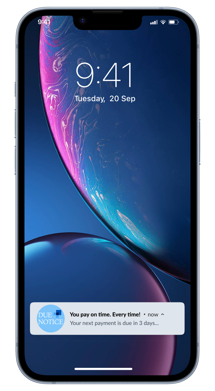
Due
Notice
A mobile-first billing redesign for a student loan servicer. At the start of every semester, call volume tripled. Students couldn't remember their account IDs, abandoned mid-payment, and called for help. This redesign cut support call volume by 62% and transformed a punitive payment experience into one users actually trusted.
As many as 200 calls a day at peak. Every one a design failure.
Three steps on paper. Dozens of decision points, 11 required inputs, and no error recovery in practice. A single mistake (wrong routing number, expired card, forgotten account ID) sent users back to the beginning with no explanation and no saved progress. Most gave up and called support instead.
The result: late fees, eroded trust, and a call center absorbing the cost of a broken interface. Every call was a symptom. The system itself was the problem.
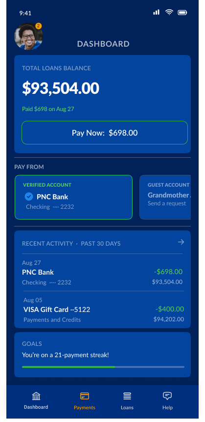
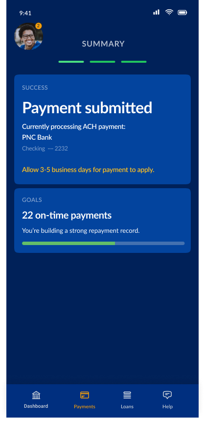
Three steps. Under a minute. No reason to call.
The north star was simple: make payments so seamless that users never need help. Account details captured once at onboarding. Every subsequent payment is pre-filled, verified, and ready. Nothing to re-enter, nowhere to fail.
We didn’t just reduce calls. We eliminated the failure points that caused them.
“The original flow was three steps with twenty places to fail.”
Design reframe · Call center analysis
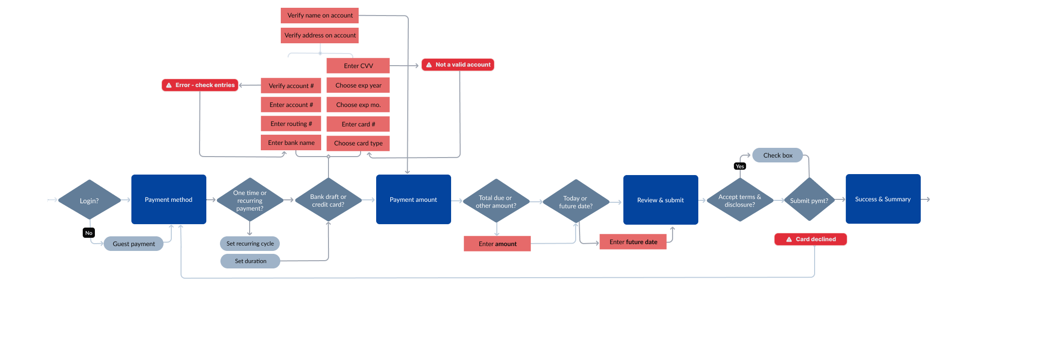
The original payment task flow. Every diamond is a decision point; red nodes are errors with no recovery path. Three steps on paper, eleven required inputs and dozens of branch points in practice.
Three steps.
Under a minute.
Every design decision traced back to one question: what would make it so seamless that users never need to call?
Three choices that changed the outcome, each one traceable back to a specific failure point in the original flow.
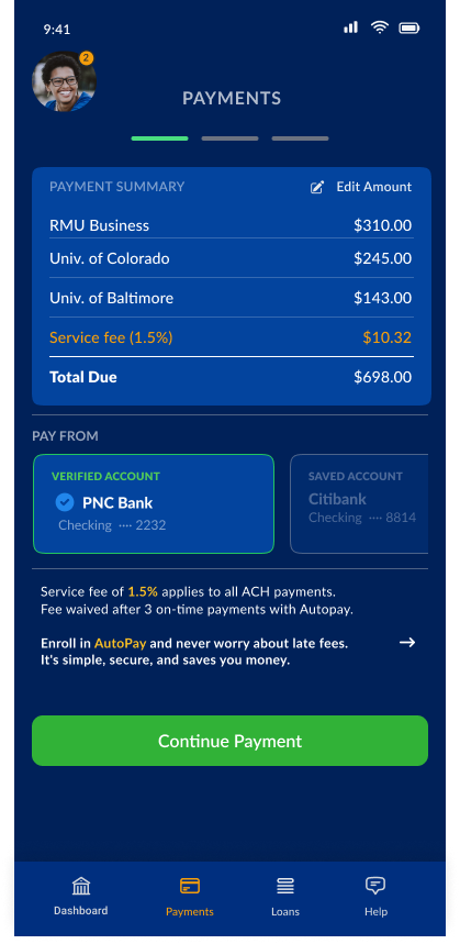
The original flow required users to re-enter account details every single time: routing numbers, account numbers, card details, expiry dates. Eleven inputs per payment, with no recovery if you made a mistake.
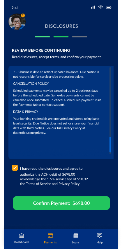
The redesign captures everything once at onboarding. From then on, Touch ID does the rest. One tap authenticates the user and pre-fills every field: payment method, amounts, loan accounts. Users confirm, they don’t re-enter. The inputs didn’t get easier. They disappeared. And because session data is encrypted and cleared automatically, fast doesn’t mean insecure.
The most reliable payment is the one a user never has to think about again. Autopay is surfaced directly on the payment screen, not buried in settings. Toggle it on, set the cycle and duration, and every subsequent payment runs automatically, split across all active loans proportionally.
Student loan borrowers often rely on family members to help cover payments. The old flow forced students to share all of their financial details just to set up a guest payment, an awkward call that put privacy at odds with getting help.
The redesign separates the experience cleanly: students send a payment link, guests see only which loans they’re contributing to. Nothing else. The student’s full account stays private. Guest financial data stays private too, unless they choose to save it for autopay. The borrower is notified when payment clears, or reminded if it hasn’t.
You eliminate the failure points that generate them. Every call was a symptom. The flow was the disease. Fixing the experience at the source is cheaper, faster, and more durable than any support layer built on top of it.
Dark mode by default wasn’t in the brief. It came from watching real users interact with the product and asking what made it easier to use. Real context reveals what controlled environments conceal.